Sunday 18 October 2015

Researching an artist

Researching the work of other artists... Scientific Drawing. 


For a City & Guilds in 'Creative Techniques; Drawing and Painting', I must review the work of other artists. One new, one old - a contemporary artists and an old master. Here I am going to take a very quick look at two scientific artists.


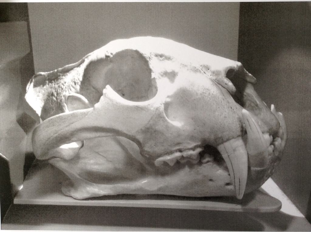
I have always loved the coming together of Art and Science, so my choice for a contemporary artist in the UK has to be this one: Katrina van Grouw. She was the curator for the Natural History Museum collections, not in Kensington, London, where the museum itself is situated, but in Buckinghamshire where the great stores of collections are kept. What a great job to have had!

I was very fortunate. Katrina came to Norwich Castle Museum to give a talk about her work as part of an exhibition "The Wonder of Birds" in 2014. I bought a copy of her book, of course.

Here is a link to the Exhibition from the Norfolk Museums Service: The Wonder of Birds.

And, here is a link to a website for Katrina van Grouw's book: The Unfeathered Bird.


Her book is a beautiful book. The illustrations are reproduced very carefully onto coloured paper. I believe the original drawings were produced on typical white paper but she chose to have them reproduced in this new colour tint to give an antique appearance. In fact, she explained the publisher found it easier to have the sheets printed with a background colour first, before the final printing, rather than to use a coloured paper. The authentic colour would be graphite on white, but not so easy on the eye as the sepia tint, an extra expense in the publishing that I think must have been well worth it.

Katrina when to great lengths to explain how she prepared her skeletons for drawing. Each drawing is produced from a real specimen, each one carefully prepared by herself in a long process of de-fleshing and cleaning the bones before reassembling them into a life-like pose. A lot of work - and not to everyone's pleasure! Few people want to have stewing bones strewn around their house!!!


There is, of course, one other scientific ornithological artist, world renowned, who also worked in another era, directly from collected specimens, each one posed in a life-like position for the purpose of a drawing; John James Audubon, (1785 - 1851).


Audubon was the first person to make a systematic survey of all the birds, and later all the mammals, of North America, reproducing each one, in a life-size, life-like pose in a book of 435 water-coloured drawings. His preparation may not have been quite so careful as Katrina van Grouw's. Audubon used specimens he shot himself, mounted onto wires to hold their position. These lasted only just long enough to produce the drawings before decomposition set in. Katrina's skeletal specimens are mounted and preserved.

Each drawing may then have been reproduced in a great folio, as a hand-coloured lithograph. Accuracy and clarity were of great importance in this type of drawing, so, Audubon's use of naturalistic poses and backgrounds is also rather ground-breaking for a scientific taxonomic work.

Audubon's illustrations can be seen here: Birds of America.

Stick and Stones

Stick and Stones and Bones and Ink and things...


Drawing in the Pyrenees in Spain, with the Artists for Nature Foundation in 2002, my wildlife art hero, Robert Bateman once said; "I found this stick. It is not an outstanding stick! It is just any old stick and broke it off. I've done this before. I often..., I don't bring a pen. I just wait until I see what is around to draw with and you get these happy accidents so that I move the stick around I not ever sure if it is going to be three lines, or one line, or a smudge, or I could rub areas with it, but the point is it is varied and surprising." He also says; "A great teacher once said in order to learn how to draw you have to make at least ten thousand mistakes. Get busy and start making them!"


It has been a little while, now. I need to get back into my drawing. So, I need to go make some mistakes! What better way to do that, than to draw with a stick and a stone. So unpredictable, might provide a surprise or two. So here goes... drawing without traditional materials, no pen, no pencil, no brush...


Something interesting to draw... a few days ago, I popped into my local museum, the Castle Museum Norwich, to take some snaps of bones in the natural history department. A fossil skull of a thunder-bird (an extinct giant) and  a skull of a polar bear caught my eye. I printed out the photos in black & white.


Today, I selected from my garden some natural materials to draw with; a dry stick, some pebbles, some dry birch bark  and soft wood I'd collected some time ago from Mousehold Health, even some egg shells saved from the kitchen.


The question... do I try some mark-making first to see how these will work with some black ink? Or, do I go for the varied and surprising approach. Of course, I want to get straight into it.

My first drawing looks a little tentative to me. An outline drawn with stick. A few smudges and varied marks with bark. But basically a line-drawing...


Time for another go. This time, I gone straight into some darks by putting in a black background. That will stop the appearance of an outline..!


This is definitely more tonal and more three-dimensional. It also looks more scary! Or do I mean gory? Proportions are not perfect but then this is a free-hand drawing, so that's okay. Big teeth. It is definitely a monster!

Over all, I am quite pleased. I will certainly try this technique again. It should be a great technique for some field sketching. I may look for more varied natural materials to work with... a pine cone, sponge, feathers, those egg shells I didn't use. Or perhaps, I should just wait to look around to see what to draw with, just as Robert Bateman would do.


A final thought - one for the future. I have seen similar ideas in books, using charcoal instead of manufactured ink. As a dry powdery material, I would guess a stick or a stone would be less effective than something softer, say a finger-tip, a bundle of grass, feathers, just something to smudge. Perhaps a hard or sharp tool could be used to scratch away an image from the smudged charcoal. And of course, charcoal comes as a ready made stick for lines.

Wednesday 30 September 2015

Urban Sketching in Norwich

Joining in with a local painting groups, I have been out and about around Norwich doing some 'urban sketching'. I don't yet feel ready for painting 'en plein air'.

The 1st July this year was a lovely sunny day in an amazing oasis of calm and beauty. We went out to the Bishop Palace Gardens in Norwich. I concentrated on drawing Bishop Salmon's Porch, a last remaining portion of a mediaeval stone and flint-rubble-built ruin.


My second drawing took in some more of the surroundings...


Personally, I like the second drawing best but the feedback from the others was interesting. They preferred the care taken over the accuracy in the first drawing. The first drawing is definitely more about the building where the second is more about the setting and less care was taken over the details.


I have not had the time or opportunity to join them once again until this week. After meeting at a centrally placed coffee shop, the decision was made to go to Upper St. Giles. This is a small mediaeval street near a region of Norwich know as 'The Lanes', leading to one of the largest churches in Norwich. St. Giles Church, has the second tallest tower for a church in Norwich.

Again I have made two drawings. Each took about 30 minutes. I do feel out of practice and I would prefer the confidence to be more accurate and less 'sketchy' (scribbly) with my drawings. However, I am pleased with the results. The Church is in fact, my second drawing.


The first drawing of the morning was this one, below, of a street called 'Cow Hill', viewed from the church yard. I was looking for examples of 'vernacular architecture', that is architecture built to a local tradition and of local materials but not necessarily to a set design...


What I noticed here, what caught my attetion, was the repeated pitched roofs, rather like dormer windows. What was intriguing perhaps does not come through in the drawing so clearly. The first three, from the right-hand-side are very regularly placed, as if recently built or renovated.

However, the first three pitches, from the left-hand-side, are somewhat irregularly spaced. The windows are even less evenly spaced, even the sills are not all level with each other. I wondered if this was a late-mediaeval/early-modern timber framed building which has perhaps been extended with the new-build designed to blend in.

Sunday 12 July 2015

Painting Pine Lines with Iceni Botanical Artists

This weekend, I joined a painting workshop with the Iceni Botanical Artists as part of a big programme of educational events for a Heritage Lottery Funded landscape partnership project called Breaking New Ground.

Botanical artists are usually very accurate and controlled with their work. This time, however, they were painting the Pine Lines of The Brecks (Breckland) which lend themselves to a very much more looser creative, expressive style. And so that is what they did. Here is some of the tutor's work on display...


We started the day with a talk from Nick Gibbons, the former, now retired, Forestry Commission conservation officer, about the history of the Pine Lines and how they came to exist - they are such an 'unlikely' feature of the landscape!

Nobody really knows their true origins but from analysis, using historical maps and estate records, landscape historian, Prof. Tom Williamson, has suggested that many began life as a type of hedge, mainly used to mark perimeter boundaries but perhaps also to cause game birds to fly higher when flushed from 18th century hunting estates.

Today, hawthorn, a woody shrub, is more commonly used in the dry Brecks. In truth, Pines grow too fast and too large. They require a lot of maintenance to be used for hedging. Historically, since mediaeval-times, gorse, a yellow-flowering shrub, then known, rather confusingly as "furze", was used atop warren banks.

Given shrubs make for much better hedges, it is a mystery why anyone decided to plant pine trees instead, except for the fact that one or two nurseries began to promote Scots Pine around the time many of the Pine Lines were first being planted. It was a fad and a fashion for the landed-estates!

For a full history of the Brecks Pine Lines, here is the 2010 report produced by Prof. Tom Williamson of the University of East Anglia for Norfolk Biodiversity Partnership... "The Breckland Pine Rows: History, Ecology and Landscape Character".

All materials were provided (by a sponsor) and a quick demonstration over. Working from a selection of photographs supplied by our tutor, Sheila O'Brien, I selected an image which appealed to me and using pencil, marked it out very lightly onto the watercolour paper, concentrating mainly on the key elements of tree trunks and horizon...


Next came the job of starting to paint using watercolours, a medium I none too confident with. First, wet the paper with a clean sponge and lay in some colour over the sky. The board, is of course, angled towards you slightly such that the water will run down the page.

Here I used Ultramarine with a just a touch of Burnt Sienna (to mix to a neutral grey) where I wished to give the impression of cloud cover. Naples Yellow (a chalky opaque colour) and Lemon Yellow, with a touch of Burnt Sienna for warmth, were used for the landscape. Again a touch of Ultramarine Blue in the corner to indicate a tarmac road surface.

Without pencil to mark where to put the leaves, I have gone free-form! The tree canopy, usually very open and clumpy, is a blueish-green in the case of Scots Pine. I made this up with two colours blended wet-in-wet and applied wet-on-dry, with a large broad brush.

The sun-lit areas are Lemon Yellow with a touch of Ultramarine, laid down first. Into that, I added dabs and daubs of Indigo Blue mixed with just a touch of the opaque Naples Yellow to make it too, chalky and dense and shadowy.


Lunch break over..! Next, came the job of bringing it altogether. I forget to leave white paper for the tree-trunks. Using a small clean brush with clean water, I lifted out the required areas, as can be seen above.

The bark of the Scots Pine is a delightful pinkish-red colour which create that very distinctive appearance of the ancient pine woodlands of Scotland which are often accentuated by the early morning autumnal mists. It can be so pinkish that Burnt Sienna is perfect with little or no mixing. Here in Norfolk, in high-summer, the colour is strong and catches the sunlight, and the eye, creating great contrast. A touch of Indigo is a perfect mix for the darker shadows.

Finally, be brave! The cast shadows... A strong mix of a dark neutral, Burnt Sienna with Ultramarine. This anchors the trees to the ground and stops the appearance of them floating a few inches above it, which can look very surreal! It has also made for good contrast with the sun-lit landscape behind the trees, helping the illusion of strong sunshine.


My first watercolour for some time and I am really quite pleased! I have achieved some bright colours (water colour can be quite pale). I have created a looser feel to the image which is a departure from the accurate drawings botanical artists usually do, and which I once did with my detailed bird studies. I could very well image using this technique for field sketches. I do feel inspired.

Something that was so fascinating was seeing just how different everyone else's work was. At the end of the day, Everyone laid out their paintings on a table display and the tutor and co-ordinator selected works for future display, a nice surprise.

Mine was chosen among a few others, to be framed and shown at various sites later in the year to promote the workshops and the Breaking New Ground project which itself was design to promote and educate people about this lesser known English landscape.


Here is a small selection of other people's work I really, really liked..!


This last one, I especially like. It is so abstract and painted free hand without pencil guidelines. The colour are beautiful and the light and shade is just perfect. What a glorious image! 

Friday 10 July 2015

Collage of a Breckland Pine Line

Breckland is a district of East Anglia stretching across the Norfolk & Suffolk border. It has a very distinctive landscape. Sandy soils and a dry climate make the area very arid by British standards. Once upon a time, mobile sand dunes use to blow across landscape, covering heaths and roads.

Since mediaeval times, the region has been too harsh for agriculture. As a result, wealthy landowners employed warreners to keep rabbits. This kept the healthland close-cropped (suitable for some rare ground nesting birds, incidentally).

In modern times came a great push for land improvement. Among the adjustments, was the planting of long lines of hedgerows to prevent wind-blown sandy soils from covering the plants. Broadleaf species did not thrive in such dry ground. The native Scots Pine was used instead.

Once economic depression brought decline in agriculture and a return to warrening, these damaged pines were left, neglected. For 200 years, they have been allowed to grow into these these very distinctive, distorted, even alien-looking trees reaching across the landscape in regimented lines.

Later, irrigation brought a return to agriculture and loss of 'natural' habitat, made more severe by the introduction of a large Forestry Commission estate with dense groves of Corsican Pine.


For this project, I have used torn paper pieces to construct a collage, but first, I made up a sheet of paper with the choice of colours I intended to use, using acrylic paints...


Before the paint dried, and rather by a happy-accident, I folded the sheet. The light colours printed across the dark giving another layer of texture and added interest...


Next, once the paint dried, it was to cut and torn-up into many small pieces...


On a fresh sheet of paper, I plotted out the image from the photograph above, which I had taken 'in the field', (see above). This line of pines is visible from the A11 main truck road through the county of Norfolk, England, near Thetford.


Using this rough guide, I then proceeded to glue the torn pieces and assemble the image like a jigsaw puzzle eventually coming up with the finished result you see here...


In fact, it was not as easy as I imaged it to be. It is very hard to see the image emerge from the pieces until near the end. Even then, you have to stand back a long way, or use a mirror. Somehow it remains not very obvious! I struck on the idea of using my iPad to photograph it. As here, you then see a very reduced image (the original is about A3 in size). It seems obvious now! A really strong graphic image. I am pleased with it. The reduced scale really helped.

Monday 6 July 2015

Jigsaw Puzzle of Sea Henge

This is a little different! I found in my local craft store a ready made small jigsaw puzzle, blank ready for an image of your choice. It came as a pack of two. I assume is designed for children. There are just a few, large pieces and the material is card, not the best for painting as it is thin, shiny and not sealed, but still worthy of an experiment or two!


Choosing another 'Heritage' theme, I painted an image of the pre-historic timber circle; "Sea Henge", taken from a book. Using acrylics, I had to separate the pieces before the paint dried and glued it all together!


You can see, I used the border-frame also. This was possibly a mistake as the image on the jigsaw pieces is tightly framed with the edge removed, but the composition still works and the image still fits.


The pieces can be separated. Like any jigsaw, the image is no longer recognisable from the pieces but I am surprised, however, just how indiscernible the image is, even when the pieces are placed next to each other, in the correct order and orientation...


"Sea Henge"is, correctly, a 'timber circle'. It was discovered near Holme-next-the-Sea, on the north-west coast of Norfolk, in 1998. The henge was excavated for preservation in 1999 and is now housed at the Lynn Museum in King's Lynn, west Norfolk. The timbers were dated to the Spring or early Summer of 2049BC.

Origami Flowers

Art studies require an element of 'not everything being flat'..! For a 3-dimensional project, I did something with origami. Following video-demonstrations on YouTube, I made a number of origami shapes; flowers. Here are the results of two very different examples, in red...


The more geometric flower is rather appealing for it's symmetry. Using different sized papers I made more before realising one could be placed inside another to create further interest. The inset is like a contrasting heart of stamens and anthers. Pale pastel colours of yellow and pink produce a stylised lotus-flower. Nice!


Using colour theory and tone, I decided to be a little braver with my choice of colours. I used two 'complementary' colours, opposites on the colour-wheel, in this case, orange and violet. In addition the orange paper is light and brightly coloured. The violet is deep, dark and somber and so contrasting nicely in tone, too. 

With two opposite-coloured flowers made, I mounted them, irregularly placed, to a painted surface. Using acrylic paint and paper with a watercolour-style, 'wet-in-wet' technique, I've created a watery background of greenish-blues. One could image these shapes floating down a river carrying a small tea-light candle in celebration. 


To apply these to a 'Heritage' theme, I realised red and white together would give the effect of a four-sided, rather geometric, Tudor-rose. The Plantagenet rose is Red for the House of Lancaster and White for the House of York. 

Here, I have combined the two colours, red and white as before, in opposite pairs, one outer and one inner, on each. 


Finally, I painted another background to mount the flower designs to. I created a textured ochre or stone-coloured surface with dry-brush marks. Over this I washed a transparent layer of primary colours; red, white and yellow, to overlay a simple Norman-style architectural pattern and placed the flower shapes at regular intervals in a band across the middle. 


These are usually five-sided, but this would be difficult to achieve in paper with origami. The last fold, produces the sepals, the outer-most petals. These are usually green on most plants and also on the Plantagenet roses. 

Normally, the centre of the York rose would be yellow, while the centre of the Lancaster rose would be white. The later Tudor rose is a combination of all three colours, red with a white heart but additionally with yellow, right in the centre. 


(The Tudor Rose.)