Sunday 12 July 2015

Painting Pine Lines with Iceni Botanical Artists

This weekend, I joined a painting workshop with the Iceni Botanical Artists as part of a big programme of educational events for a Heritage Lottery Funded landscape partnership project called Breaking New Ground.

Botanical artists are usually very accurate and controlled with their work. This time, however, they were painting the Pine Lines of The Brecks (Breckland) which lend themselves to a very much more looser creative, expressive style. And so that is what they did. Here is some of the tutor's work on display...


We started the day with a talk from Nick Gibbons, the former, now retired, Forestry Commission conservation officer, about the history of the Pine Lines and how they came to exist - they are such an 'unlikely' feature of the landscape!

Nobody really knows their true origins but from analysis, using historical maps and estate records, landscape historian, Prof. Tom Williamson, has suggested that many began life as a type of hedge, mainly used to mark perimeter boundaries but perhaps also to cause game birds to fly higher when flushed from 18th century hunting estates.

Today, hawthorn, a woody shrub, is more commonly used in the dry Brecks. In truth, Pines grow too fast and too large. They require a lot of maintenance to be used for hedging. Historically, since mediaeval-times, gorse, a yellow-flowering shrub, then known, rather confusingly as "furze", was used atop warren banks.

Given shrubs make for much better hedges, it is a mystery why anyone decided to plant pine trees instead, except for the fact that one or two nurseries began to promote Scots Pine around the time many of the Pine Lines were first being planted. It was a fad and a fashion for the landed-estates!

For a full history of the Brecks Pine Lines, here is the 2010 report produced by Prof. Tom Williamson of the University of East Anglia for Norfolk Biodiversity Partnership... "The Breckland Pine Rows: History, Ecology and Landscape Character".

All materials were provided (by a sponsor) and a quick demonstration over. Working from a selection of photographs supplied by our tutor, Sheila O'Brien, I selected an image which appealed to me and using pencil, marked it out very lightly onto the watercolour paper, concentrating mainly on the key elements of tree trunks and horizon...


Next came the job of starting to paint using watercolours, a medium I none too confident with. First, wet the paper with a clean sponge and lay in some colour over the sky. The board, is of course, angled towards you slightly such that the water will run down the page.

Here I used Ultramarine with a just a touch of Burnt Sienna (to mix to a neutral grey) where I wished to give the impression of cloud cover. Naples Yellow (a chalky opaque colour) and Lemon Yellow, with a touch of Burnt Sienna for warmth, were used for the landscape. Again a touch of Ultramarine Blue in the corner to indicate a tarmac road surface.

Without pencil to mark where to put the leaves, I have gone free-form! The tree canopy, usually very open and clumpy, is a blueish-green in the case of Scots Pine. I made this up with two colours blended wet-in-wet and applied wet-on-dry, with a large broad brush.

The sun-lit areas are Lemon Yellow with a touch of Ultramarine, laid down first. Into that, I added dabs and daubs of Indigo Blue mixed with just a touch of the opaque Naples Yellow to make it too, chalky and dense and shadowy.


Lunch break over..! Next, came the job of bringing it altogether. I forget to leave white paper for the tree-trunks. Using a small clean brush with clean water, I lifted out the required areas, as can be seen above.

The bark of the Scots Pine is a delightful pinkish-red colour which create that very distinctive appearance of the ancient pine woodlands of Scotland which are often accentuated by the early morning autumnal mists. It can be so pinkish that Burnt Sienna is perfect with little or no mixing. Here in Norfolk, in high-summer, the colour is strong and catches the sunlight, and the eye, creating great contrast. A touch of Indigo is a perfect mix for the darker shadows.

Finally, be brave! The cast shadows... A strong mix of a dark neutral, Burnt Sienna with Ultramarine. This anchors the trees to the ground and stops the appearance of them floating a few inches above it, which can look very surreal! It has also made for good contrast with the sun-lit landscape behind the trees, helping the illusion of strong sunshine.


My first watercolour for some time and I am really quite pleased! I have achieved some bright colours (water colour can be quite pale). I have created a looser feel to the image which is a departure from the accurate drawings botanical artists usually do, and which I once did with my detailed bird studies. I could very well image using this technique for field sketches. I do feel inspired.

Something that was so fascinating was seeing just how different everyone else's work was. At the end of the day, Everyone laid out their paintings on a table display and the tutor and co-ordinator selected works for future display, a nice surprise.

Mine was chosen among a few others, to be framed and shown at various sites later in the year to promote the workshops and the Breaking New Ground project which itself was design to promote and educate people about this lesser known English landscape.


Here is a small selection of other people's work I really, really liked..!


This last one, I especially like. It is so abstract and painted free hand without pencil guidelines. The colour are beautiful and the light and shade is just perfect. What a glorious image! 

Friday 10 July 2015

Collage of a Breckland Pine Line

Breckland is a district of East Anglia stretching across the Norfolk & Suffolk border. It has a very distinctive landscape. Sandy soils and a dry climate make the area very arid by British standards. Once upon a time, mobile sand dunes use to blow across landscape, covering heaths and roads.

Since mediaeval times, the region has been too harsh for agriculture. As a result, wealthy landowners employed warreners to keep rabbits. This kept the healthland close-cropped (suitable for some rare ground nesting birds, incidentally).

In modern times came a great push for land improvement. Among the adjustments, was the planting of long lines of hedgerows to prevent wind-blown sandy soils from covering the plants. Broadleaf species did not thrive in such dry ground. The native Scots Pine was used instead.

Once economic depression brought decline in agriculture and a return to warrening, these damaged pines were left, neglected. For 200 years, they have been allowed to grow into these these very distinctive, distorted, even alien-looking trees reaching across the landscape in regimented lines.

Later, irrigation brought a return to agriculture and loss of 'natural' habitat, made more severe by the introduction of a large Forestry Commission estate with dense groves of Corsican Pine.


For this project, I have used torn paper pieces to construct a collage, but first, I made up a sheet of paper with the choice of colours I intended to use, using acrylic paints...


Before the paint dried, and rather by a happy-accident, I folded the sheet. The light colours printed across the dark giving another layer of texture and added interest...


Next, once the paint dried, it was to cut and torn-up into many small pieces...


On a fresh sheet of paper, I plotted out the image from the photograph above, which I had taken 'in the field', (see above). This line of pines is visible from the A11 main truck road through the county of Norfolk, England, near Thetford.


Using this rough guide, I then proceeded to glue the torn pieces and assemble the image like a jigsaw puzzle eventually coming up with the finished result you see here...


In fact, it was not as easy as I imaged it to be. It is very hard to see the image emerge from the pieces until near the end. Even then, you have to stand back a long way, or use a mirror. Somehow it remains not very obvious! I struck on the idea of using my iPad to photograph it. As here, you then see a very reduced image (the original is about A3 in size). It seems obvious now! A really strong graphic image. I am pleased with it. The reduced scale really helped.

Monday 6 July 2015

Jigsaw Puzzle of Sea Henge

This is a little different! I found in my local craft store a ready made small jigsaw puzzle, blank ready for an image of your choice. It came as a pack of two. I assume is designed for children. There are just a few, large pieces and the material is card, not the best for painting as it is thin, shiny and not sealed, but still worthy of an experiment or two!


Choosing another 'Heritage' theme, I painted an image of the pre-historic timber circle; "Sea Henge", taken from a book. Using acrylics, I had to separate the pieces before the paint dried and glued it all together!


You can see, I used the border-frame also. This was possibly a mistake as the image on the jigsaw pieces is tightly framed with the edge removed, but the composition still works and the image still fits.


The pieces can be separated. Like any jigsaw, the image is no longer recognisable from the pieces but I am surprised, however, just how indiscernible the image is, even when the pieces are placed next to each other, in the correct order and orientation...


"Sea Henge"is, correctly, a 'timber circle'. It was discovered near Holme-next-the-Sea, on the north-west coast of Norfolk, in 1998. The henge was excavated for preservation in 1999 and is now housed at the Lynn Museum in King's Lynn, west Norfolk. The timbers were dated to the Spring or early Summer of 2049BC.

Origami Flowers

Art studies require an element of 'not everything being flat'..! For a 3-dimensional project, I did something with origami. Following video-demonstrations on YouTube, I made a number of origami shapes; flowers. Here are the results of two very different examples, in red...


The more geometric flower is rather appealing for it's symmetry. Using different sized papers I made more before realising one could be placed inside another to create further interest. The inset is like a contrasting heart of stamens and anthers. Pale pastel colours of yellow and pink produce a stylised lotus-flower. Nice!


Using colour theory and tone, I decided to be a little braver with my choice of colours. I used two 'complementary' colours, opposites on the colour-wheel, in this case, orange and violet. In addition the orange paper is light and brightly coloured. The violet is deep, dark and somber and so contrasting nicely in tone, too. 

With two opposite-coloured flowers made, I mounted them, irregularly placed, to a painted surface. Using acrylic paint and paper with a watercolour-style, 'wet-in-wet' technique, I've created a watery background of greenish-blues. One could image these shapes floating down a river carrying a small tea-light candle in celebration. 


To apply these to a 'Heritage' theme, I realised red and white together would give the effect of a four-sided, rather geometric, Tudor-rose. The Plantagenet rose is Red for the House of Lancaster and White for the House of York. 

Here, I have combined the two colours, red and white as before, in opposite pairs, one outer and one inner, on each. 


Finally, I painted another background to mount the flower designs to. I created a textured ochre or stone-coloured surface with dry-brush marks. Over this I washed a transparent layer of primary colours; red, white and yellow, to overlay a simple Norman-style architectural pattern and placed the flower shapes at regular intervals in a band across the middle. 


These are usually five-sided, but this would be difficult to achieve in paper with origami. The last fold, produces the sepals, the outer-most petals. These are usually green on most plants and also on the Plantagenet roses. 

Normally, the centre of the York rose would be yellow, while the centre of the Lancaster rose would be white. The later Tudor rose is a combination of all three colours, red with a white heart but additionally with yellow, right in the centre. 


(The Tudor Rose.)

Brass Rubbing at St Peter Hungate

St. Peter Hungate is a disused church in city centre of Norwich It was once used as a museum for ecclesiastical art by the Norfolk Archaeological Trust. It has since re-opened and rebranded itself as Hungate Medieval Art. www.hungate.org.uk

Replica brasses were available when the church was used as a museum but went into storage. Fortunately, these have been issued on loan from the Norfolk Museums and Archaeological Service, bringing them back to St Peter Hungate. What good news! I do like it when community organisations work together to support each other.

Replicas are made because abrasion from continually taking rubbings from original brasses would eventually cause irrepairable damage to the soft metal. The datails would eventually be rubbed away leaving the brass looking smoothly polished. Replicas also allows for a collection of brasses from various places. Often they are reduced in scale to half or a third original size.


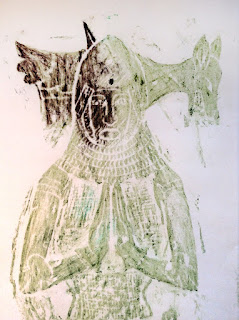
Rubbings are taken with a hard pigmented wax. The hardness prevents the wax from filling in the carved details. The surface, in relief, 'prints', creating the image which emerges bit by bit. The effect is rather like a black & white photograph in a developing tray - strangely exciting!

This first character is Sir Humphrey Stafford, 1548, from Blatherwyck, Northamptonshire...


Popular with children, rubbings can be done with typical wax crayons, although the quality is low, the result is quick - great for short spans of attention!


The professionals' wax makes for a far better result..!


This character is Sir John de Foxley (Foxle), hence the fox motif behind his head. He dates from 1378, and comes from Bray, Berkshire, England. Here he is in full-length glory..!


I love the black wax. It make a really inky look to the rubbing. However, there are other colours too! Here is one in bronze with touches of gold to add extra shine...


She is Lady Matilda (Maud) de Foxley (Foxle), 1378 of Bray, Berkshire, in England, the first wife of Sir John de Foxley. If you look closely, you see an heraldic lion wrapped around her dress...


Of course, these metallic colours are great on black paper, too. Silver shows up very well.

This fella is Sir George Speke, 1528, Dowlish Wake, Somerset in south-west England. He is shown wearing plate armour, sword and spurs, but without a helmet. (Slightly too large to fit the sheet of paper, he is diagonally across the page.)


Not all brasses are noble men and women in prayer. Some are rather macabre, like this one...


He is a skeleton wrapped in a shroud tied at his feet. He is a state of decay and worms are coming out of his eyes! Here is a closer look...


His name is Ralph Hamsterley, Rector and Fellow of Merton College, Oxford. Oddly, this brass, from Oddington, Oxford, was made in 1510 even though Hamsterley did not die until 1518. Sometimes, these brasses were made in somber readiness for death. How grim!

Sunday 5 July 2015

Sampling Heritage Screen-printmaking

For a City & Guilds in Creative Techniques, I have been experimenting with mixed media  and screen printing. Unit two is all about 'Sampling', applying different techniques to see what works and what doesn't. But broadly, I think this has been a successful experiment.

'Heritage' is my chosen topic, in this case a building. This is Mildenhall Warren Lodge, maintained by the Friends of Thetford Forest Park. It is one of just two such mediaeval warreners' buildings of it's type still standing the Breckland district of Norfolk and Suffolk. The other is Thetford Warren Lodge, maintained by Heritage England (formerly English Heritage). A third warrener's lodge, Ickburgh, stands a ruin, just one corner remains, under the care of the Forestry Commission. Warrening is a form of rabbit farming popular in mediaeval times.

The base of the image is a very simple screen-print, whereby the building has been broken down into basic geomatric shapes, laid down as a stencil made from cut newspaper in such way that the the ink drawn through the screen lays down a colour for the background, leaving negative empty shapes. As you pull the ink across the screen, it also sticks the stencil to the screen, ready for the next print. I chose simple green and blue to represent grass and sky. Nothing too challenging!


After a few prints have been made it is essential to wash the screen thoroughly to prevent the acrylic inks from drying and clogging the fine mesh, so ruining the scree and preventing future use. If you are doing a long print run, you may still have to wash the screen periodically to prevent permanent damage to the screen from dried ink. This would then require a fresh stencil to be made.


By not thoroughly mixing the colours (or by moving one colour through another) it is possible to create a marbling effect with the printed areas. Also, by dropping clear medium directly onto the screen it is possible to block some colour, giving irregular lighter patches for additional texture, too.

A textured material has also been used to give a pattern the the roof, in this print.


Once a number of prints have been made, enough to experiment with, the fun begins! Each image has the details of the warrener's lodge added in a different way.

The first uses the same acrylic paint (without printing medium) to paint in some detail...


The second uses nothing more complicated than pen & ink... (and a texture print for the roof). Artist quality pens with different shade of grey to black ink, and with different size nibs, fine-tip to broad-brush, have been used.


The third in this series, so far, is a little more interesting! Here, I used textured materials to fill in some colour to the surfaces of the building (the negative, geometric spaces), and then cut out coloured papers in the rough shapes of the architectural details and glued them to the surface. The resultant image has a 'naive-art' quality which is rather appealing..!


The large grey panels represent the remains of a render applied to the walls when a lean-to extension was added in the later use of the building, before falling derelict. A low wall, the remains of another lean-to extension, are also added with cut coloured papers. A filled-in Victorian window is also visible made of red brick. The mediaeval walls are of flint and rubble construction.

The roof is brand new, built in May 2012, made from red pan tiles and timbers taken from the Forestry Commission estate nearby. It was designed to be similar the last roof on the building, historically, as seen in old archived black & white photograph of the 1930s. It will help preserve the ancient building into the future.

The story of restoration project can be followed here: http://www.fotf.org.uk/content/micro_sites/fotf_projects/fotf_projects_mildenhall_warren.shtml